Documentation Index Fetch the complete documentation index at: https://cometchat-22654f5b-docs-android-v6-beta2.mintlify.app/llms.txt
Use this file to discover all available pages before exploring further.
{ "component" : "CometChatThreadedHeader" , "package" : "cometchat_chat_uikit" , "import" : "import 'package:cometchat_chat_uikit/cometchat_chat_uikit.dart';" , "description" : "A widget that displays the parent message of a thread along with a reply count, used as the header section in threaded message views" , "primaryOutput" : { "prop" : "messageActionView" , "type" : "Widget Function(BaseMessage message, BuildContext context)?" }, "props" : { "data" : { "parentMessage" : { "type" : "BaseMessage" , "required" : true , "note" : "Parent message for the thread" }, "loggedInUser" : { "type" : "User" , "required" : true , "note" : "Logged in user object" }, "template" : { "type" : "CometChatMessageTemplate?" , "default" : "null" , "note" : "Message template used in the thread" }, "height" : { "type" : "double?" , "default" : "null" , "note" : "Height of the widget" }, "width" : { "type" : "double?" , "default" : "null" , "note" : "Width of the widget" } }, "visibility" : { "receiptsVisibility" : { "type" : "bool?" , "default" : true } }, "viewSlots" : { "messageActionView" : "Widget Function(BaseMessage message, BuildContext context)?" } }, "events" : [], "sdkListeners" : [], "compositionExample" : { "description" : "CometChatThreadedHeader is typically used within CometChatThreadedMessages as the header component" , "components" : [ "CometChatThreadedMessages" , "CometChatMessageList" , "CometChatMessageComposer" ], "flow" : "Parent message displayed at top → Reply count shown → Message list below with replies" }, "types" : {} }
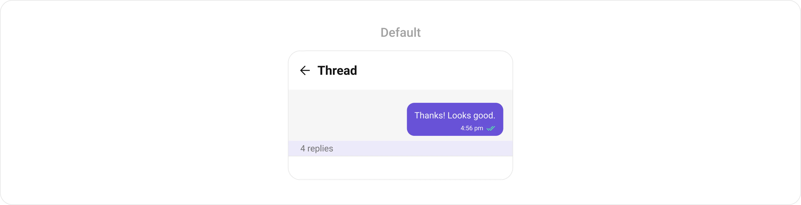
Where It Fits CometChatThreadedHeader is a component that displays the parent message of a thread along with a reply count. It’s typically used as part of the ThreadedMessages composite component, appearing at the top of the threaded conversation view.
ThreadedMessages is composed of the following widgets:
Widget Description MessageList CometChatMessageList displays a list of reply messages MessageComposer CometChatMessageComposer helps in writing and sending replies
Minimal Render The simplest way to render CometChatThreadedHeader:
import 'package:cometchat_chat_uikit/cometchat_chat_uikit.dart' ; CometChatThreadedHeader ( parentMessage : parentMessage, // Required: BaseMessage object loggedInUser : loggedInUser, // Required: User object )
You can also launch it using Navigator:
Navigator . push ( context, MaterialPageRoute ( builder : (context) => CometChatThreadedHeader ( loggedInUser : loggedInUser, parentMessage : parentMessage, ), ), );
Or embed it as a widget:
import 'package:cometchat_chat_uikit/cometchat_chat_uikit.dart' ; import 'package:flutter/material.dart' ; class ThreadMessages extends StatefulWidget { const ThreadMessages ({ super .key}); @override State < ThreadMessages > createState () => _ThreadMessagesState (); } class _ThreadMessagesState extends State < ThreadMessages > { @override Widget build ( BuildContext context) { return Scaffold ( body : SafeArea ( child : CometChatThreadedHeader ( loggedInUser : loggedInUser, parentMessage : parentMessage, ), ), ); } }
Actions and Events Callback Props The CometChatThreadedHeader component does not have traditional callback props. Instead, it provides a messageActionView slot for customizing the action area.
Global UI Events The CometChatThreadedHeader component does not produce any global UI events.
Custom View Slots Customize the appearance of CometChatThreadedHeader by replacing default views with your own widgets.
Slot Signature Replaces messageActionViewWidget Function(BaseMessage message, BuildContext context)?Reply count section below the message bubble
Example: Custom Message Action View CometChatThreadedHeader ( loggedInUser : loggedInUser, parentMessage : parentMessage, messageActionView : ( BaseMessage baseMessage, BuildContext context) { return Container ( width : MediaQuery . of (context).size.width / 1.2 , margin : const EdgeInsets . all ( 10 ), decoration : BoxDecoration ( color : Color ( 0xFF6851D6 ), borderRadius : BorderRadius . circular ( 10 ), border : Border . all (width : 5 , color : Color ( 0xFF6851D6 )), ), child : const Center ( child : Text ( "Your Custom Action View" , style : TextStyle (color : Colors .white), ), ), ); }, )
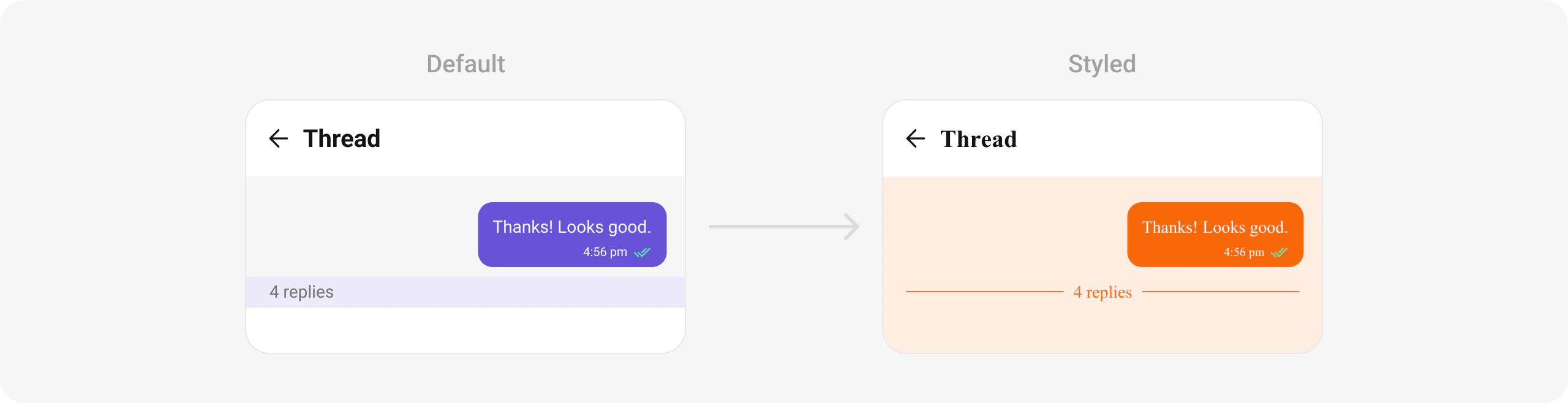
Example: Custom Reply Count with Dividers CometChatThreadedHeader ( parentMessage : message, loggedInUser : CometChatUIKit .loggedInUser ! , style : CometChatThreadedHeaderStyle ( bubbleContainerBackGroundColor : Color ( 0xFFFEEDE1 ), outgoingMessageBubbleStyle : CometChatOutgoingMessageBubbleStyle ( backgroundColor : Color ( 0xFFF76808 ), borderRadius : BorderRadius . circular ( 12 ), ), ), messageActionView : (message, context) { final numberOfReplies = message.replyCount; String replyText = numberOfReplies == 1 ? Translations . of (context).reply : Translations . of (context).replies; return Container ( width : double .maxFinite, color : Color ( 0xFFFEEDE1 ), padding : EdgeInsets . symmetric (vertical : 4 ), child : Row ( children : [ Flexible (child : Divider (color : Color ( 0xFFF76808 ))), Padding ( padding : EdgeInsets . symmetric (horizontal : 8 ), child : Text ( " $ numberOfReplies $ replyText " , style : TextStyle ( color : Color ( 0xFFF76808 ), fontSize : 14 , fontWeight : FontWeight .w400, ), ), ), Flexible (child : Divider (color : Color ( 0xFFF76808 ))), ], ), ); }, )
Templates The template prop is used to configure and set a message template for the parent message bubble. It allows for dynamic customization of message appearance, content, or other predefined settings based on the template provided.
CometChatThreadedHeader ( parentMessage : parentMessage, loggedInUser : loggedInUser, template : CometChatMessageTemplate ( type : MessageTypeConstants .text, category : MessageCategoryConstants .message, // Custom template configuration ), )
Styling Customize the appearance of CometChatThreadedHeader using CometChatThreadedHeaderStyle.
CometChatThreadedHeader ( parentMessage : parentMessage, loggedInUser : loggedInUser, style : CometChatThreadedHeaderStyle ( bubbleContainerBackGroundColor : Color ( 0xFFFEEDE1 ), countTextColor : Colors .purple, countContainerBackGroundColor : Colors .grey[ 100 ], incomingMessageBubbleStyle : CometChatIncomingMessageBubbleStyle ( backgroundColor : Colors .grey[ 200 ], ), outgoingMessageBubbleStyle : CometChatOutgoingMessageBubbleStyle ( backgroundColor : Color ( 0xFFF76808 ), borderRadius : BorderRadius . circular ( 12 ), ), ), )
Style Properties Property Type Description bubbleContainerBackGroundColorColor?Background color for the bubble container bubbleContainerBorderBoxBorder?Border for the bubble container bubbleContainerBorderRadiusBorderRadiusGeometry?Border radius for the bubble container countTextStyleTextStyle?Text style for the reply count countTextColorColor?Color for the reply count text countContainerBackGroundColorColor?Background color for the count container countContainerBorderBoxBorder?Border for the count container constraintsBoxConstraints?Constraints for the message container incomingMessageBubbleStyleCometChatIncomingMessageBubbleStyle?Style for incoming message bubble outgoingMessageBubbleStyleCometChatOutgoingMessageBubbleStyle?Style for outgoing message bubble
Props Reference Prop Type Default Description parentMessageBaseMessageRequired Parent message for the thread loggedInUserUserRequired Logged in user object messageActionViewFunction(BaseMessage, BuildContext)?nullCustom action view for the message styleCometChatThreadedHeaderStyle?nullStyle parameter for the threaded header templateCometChatMessageTemplate?nullMessage template used in the thread heightdouble?nullHeight of the widget widthdouble?nullWidth of the widget receiptsVisibilitybool?trueControls visibility of receipts
Message List Display messages in a conversation
Message Composer Compose and send messages
Theming Learn how to customize the look and feel
Localization Support multiple languages in your app