Documentation Index
Fetch the complete documentation index at: https://cometchat-22654f5b-docs-android-v6-beta2.mintlify.app/llms.txt
Use this file to discover all available pages before exploring further.
CometChatActionSheet is a DraggableScrollableSheet which shows each ActionItem and returns the ActionItem that is clicked on . You can customize the appearance of CometChatActionSheet too.
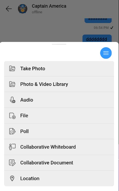
How to integrate CometChatActionSheet ?
SinceCometChatActionSheet is a DraggableScrollableSheet , it can be called directly by using showCometChatActionSheet method. CometChatActionSheet includes various parameters to customize its UI.
Usage
- Dart
Properties
| Parameters | Type | Description |
|---|---|---|
| context | BuildContext | Used to set the location in the widget where the AcionSheet needs to be shown |
| backgroundColor | Color | Used to set background color |
| actionItems | List<ActionItem> | Used to set list of action items |
| iconBackground | Color | Used to set icon background color |
| title | String | Used to set title |
| titleStyle | TextStyle | Used to set title style |
| isLayoutModeIconVisible | bool | Used to toggle visibility of layout mode icon |
| layoutModeIcon | IconData | used to set the icon to display |
| layoutIconColor | Color | Used to set layout Mode Icon Color |
| isTitleVisible | bool | Used to toggle title visibility |
| isGridLayout | bool | Used to toggle between list view or grid view |
| alertShapeBorder | ShapeBorder | Used to shape ActionSheet |
ActionItem
ActionItem is the model class used to pass data at different places such as CometChatActionSheet.A list of ActionItem is passed to the CometChatActionSheet which renders it according to the styling parameters passed
Properties
| Parameters | Type | Description |
|---|---|---|
| id | String | Used to uniquely identify each ActionItem |
| title | String | Used to set the title visible against each ActionItem |
| iconUrl | String | Used to set IconUrl |
| iconUrlPackageName | String | Used to set IconUrl package name , used only when |
| titleStyle | TextStyle | Used to set title style |
| iconBackground | Color | Used to set icon background |
| iconCornerRadius | double | Used to set icon corner radius |
| background | Color | Used to set background color |
| cornerRadius | double | Used to set corner radius |
| onItemClick | dynamic | an parameter to hold any extra data with each ActionItem , internally used to set functions which are invoked later |
If dart compiler is not able to identify ActionItem from the chat ui kit package because its conflicting with other imports, alias can be created as
import 'package:flutter_chat_ui_kit/flutter_chat_ui_kit.dart' as uikit; > > and used like uikit.ActionItem wherever needed- Dart